


A Home in Lawrence Park Embraces Bright Ideas


Designer Theresa Casey turns an everyday family home into a compelling case for colour
For some, embracing colourful in the home is an act of bold rebellion. For Theresa Casey, principal of Casey Design, it’s a natural language—one that she uses to craft deeply personal, visually arresting interiors. In her latest project, a Lawrence Park home renovation for a long-time client, Casey celebrated vibrant hues, seamlessly integrating them into the dwelling’s architecture and everyday living spaces.


In the entrance of the home, a near-Avocado green storage unit sets the stage for a colour feast. Millwork and paint, Casey Design.
This project marked the third collaboration between Casey and the homeowners, a professional couple with two young children. “They trust me, and I trust them,” Casey says. “That relationship is key to creating these deeply personal spaces.” The homeowners, energetic and enthusiastic about personal style, gave her free rein to explore bold colour applications that reflect their dynamic lifestyle.
As Casey describes it, many of her clients approach her without a clear vision but with an openness to discovery. “A lot of times, people connect with me because they don’t know what they want,” she says. “My job is to interpret who they are and what they think they’re looking for, then bring that to life in their space.”

Dining table, Nuevo; flooring, King Haven Construction.

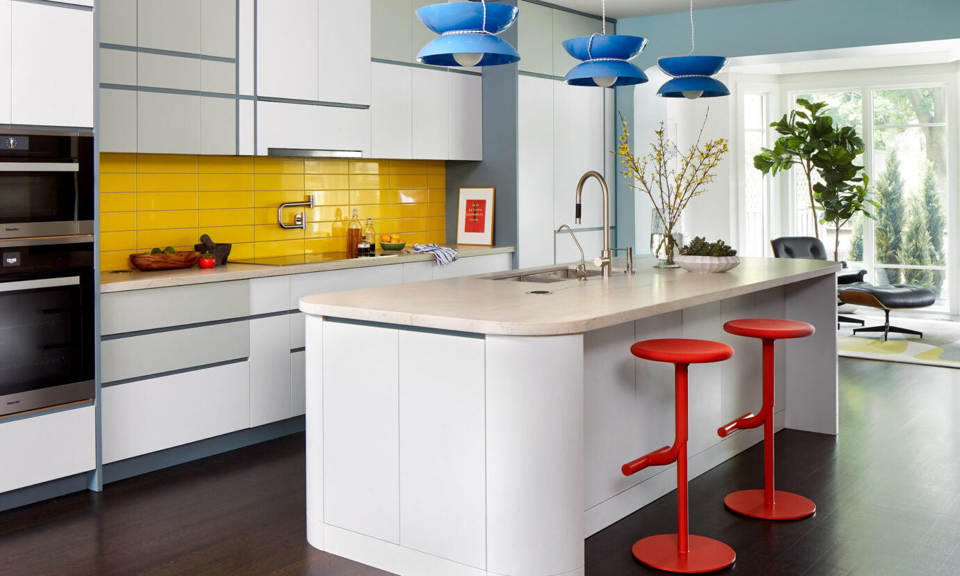
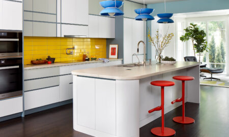
The colourful home’s kitchen is equipped with a bright coffee nook for breakfast gatherings.

In the kitchen coffee bar, powdery blue cabinetry complements a bright orange backsplash courtesy of Olympia Tile + Stone.
The starting point for this colourful home renovation was the kitchen—a space Casey approached like a blank canvas. “I designed the cabinet locations and functions first,” she explains, “then treated it as a geometric composition using three neutral colours.” From there, vibrant oranges and lemon yellows were introduced, injecting an optimistic essence into every detail. Setting the tone for the rest of the home, the kitchen’s fearless use of colour reflects a distinctly European sensibility, reminiscent of the vibrant interiors found in Danish homes and Italian flats. The interplay of bold hues, geometric compositions and a playful yet disciplined application of colour creates an artful approach often associated with European design. “It feels a little European,” Casey acknowledges. “I don’t feel like this is a Toronto home in any typical sense.”


Bar stools, Design Within Reach; pendants, LightForm, countertop, Cosentino.
Casey’s strategic use of colour is also designed to encourage movement through the home, delineating spaces without relying on walls. “An example is the transition from the kitchen to the family room,” she says. “I created a blue-painted curved arch to mark that shift. The walls in the family room are neutral, but colour is carried through in the furnishings.” A patterned area rug, which echoes the hues of the kitchen while softening its geometry, connects the two spaces.


This specific shade of blue was a custom creation by Casey Design. Chair, Herman Miller; rug, side table, Avenue Road.
With a background in both design and fine art, she understands how to balance bold tones without overwhelming a space. “I think I have a natural inclination to colour, but my training is what allows me to make it work,” she says.


Sofa, Herman Miller; throw pillows, Design Within Reach; coffee table, Avenue Road.


Wallpaper, Hollace Cluny; sink, Ginger’s; light fixture, Casa Di Luce.


Stairway to the colourful home’s second floor.


A taste for ’70s design aesthetics comes to life in the home’s principal bedroom. Headboard, Casey Design; rug, Elte.


Table lamp, Decorum Decorative Finds.


Offset by accents of colour, the all-white principal bathroom makes a statement with minimalism.
The living room, for instance, embraces a more subdued but equally intentional palette. A deep blue encloses the space, making it a cozy retreat compared to the home’s more vibrant open areas. “It’s not a light colour, but it’s not dreary,” she says. “To me, it’s inviting.”


Tile, Olympia Tile + Stone; accent chair, Kiosk.
Casey’s influences are as varied as they are inspiring. She cites Russian Constructivist graphics, mid-century design and the work of textile artist Sonia Delaunay as reference points. “She once said, ‘She who knows how to appreciate colour relationships and the influence of one colour on another, their contrasts and dissonances, is promised an infinitely diverse imagery,’” Casey shares. “That really resonates with me. I’m always thinking, what happens when I put this colour next to that one? Does it create interest? Does it feel right?”


Built-in bookshelves, painted in the same rich hue as the rest of the space, add texture and depth while maintaining a sense of continuity.
“I love warm wood interiors, but it’s refreshing to see colour embraced in this way,” she says. “When I step into this home, I feel happy. It has a positive energy.” For city dwellers hesitant to take the plunge, her advice is simple: start small, introduce one statement piece, and let the space evolve naturally. “It’s about finding balance,” she notes. “Colour should work for your lifestyle, not against it.”
Ultimately, Casey’s approach is not just about aesthetics—it’s about reimagining how we engage with our homes. In this renovation, she proves that when thoughtfully applied, bold colour doesn’t just enliven a space; it reshapes the way we live in it.

